
Autopsy of an editorial experiment
HEAD – Publishing's multi-platform books collection Manifestes
Abstract
The HEAD – Genève’s policy is to defend access to the knowledge it produces. To this end, the HEAD launched a new multi-media editorial unit called HEAD – Publishing, whose first collection, Manifestes, brings together short, incisive theoretical texts by teachers and researchers from the school. HEAD – Publishing’s originality lies in the fact that it offers these works in the form of printed books sold in bookshops, but also in print-on-demand, free ePub versions and screen reading on the HEAD – Publishing website. The books were designed through an innovative process that questions the relationship between printed and digital books. The initiators of the project – Julie Enckell Julliard, Anthony Masure and Dimitri Broquard – report here on this editorial experience.
Text
Open books. HEAD – Publishing, a team committed to the distribution of knowledge
By Anthony Masure
The Covid-19 pandemic, with the consequent closing of bookstores and libraries in 2020, has evinced the need to make books available in digital form. Many publishers normally not fond of online publication have made their titles available digitally so as not to lose readers. Cultural institutions have stepped up their online activities. The research world, for its part, has reacted to the Covid situation by doing more to encourage open access, making it a contractual requirement for publicly-funded projects that the results be delivered in a form consultable online without a paywall.1
But what, exactly, is meant by the term “digital book”? Admittedly, there is no one single definition. The term may refer to specific file formats (ePub, HTML, PDF), reading practices (navigation via hyperlinks, multiterminal consultation) or business models (particular distribution circuits). Going further, we have to examine what features in the centuries-old cultural form called books impede the emergence of other forms of delivering the same content. In fact, our concept of a book remains bound to the concept of the printed book, as if a digital book could never be more than a dematerialized copy. But changing work processes involves more than just the acquisition of new skills and modes; it implies a redefinition of reading and writing in the digital sphere. In other words, how can a digital culture be imprinted on institutions where the traditional book paradigm still reigns?
Difficulties in conceiving “truly” digital books
To address this conundrum, we have to start by examining a series of issues arising from digital books as we have known them:
– The page paradigm remains the model of reference for reading interfaces, especially the massive use of PDF (Portable Document Format, 1992). A PDF is an ensemble of geometric coordinates that make possible a faithful print reproduction of what’s seen on the screen (“what you see is what you get”), meant to facilitate working with printers. While able to coordinate footnotes and page numbers,2 the format suffers from not being “semantic”3 (the data is not structured logically), and therefore not accessible for visually impaired people. It can’t do dynamic (responsive) page layout, and therefore is not appropriate for all screen formats. Further, it is not correctly indexed by search engines, so the whole file has to be downloaded to find particular content.
– The multiplicity of formats (ePub, HTML, PDF, apps, etc.) and terminal types presents an obstacle to the production of digital books. They not only have to master different programing languages (especially Web) but also acquire an interface culture, which means a familiarity with digital objects in all their diversity (Web sites, applications, video games, motion design, etc.) – the analysis of these productions necessitates the development of new methodologies.4
– The instability of business practices and models holds back development. The ePub format, for example, has not really taken off because it simply duplicates standard Web technologies, which are constantly changing, unlike e-reader operating systems such as Kobo and Kindle. Furthermore, the multiplication of online reading media (articles, podcasts, videos, Web
sites, etc.), along with the possibility of inserting hyperlinks and comments in the content, make it hard to conceive an e-book as a closed unit.
– Graphic design practices associated with print books require close attention to the physical production of the object, as well as things like layout grids and microtypography. In contrast, digital environments are inherently variable and changing, so that the reproduction of the text can never be under total control. The techniques adopted by “artistic” or “auteur” graphic designers can conflict with the standardization of software and digital work environments (frameworks), with the consequent risk of “aesthetic globalization.”5
“Manifestes”: A series of multi-media, copyright-free books
Now let’s take a look at a case study that highlights the difficulties involved in migrating from the print model to a multiplatform approach. Seeking to bring the production of its titles in-house and publish them in a variety of formats, in 2020 the Haute école d’art et de design de Genève (HEAD – Genève, HES-SO) undertook a restructuring of its publication process with the launching of the imprint HEAD – Publishing, a multiplatform publishing team whose purpose is to enhance the Geneva school’s practical, theoretical and critical work. The initiative was taken by Julie Enckell Julliard (director of cultural development and publications), Anthony Masure (research director) and Dimitri Broquard (director of the Visual Communications department). A dedicated Web site (https://head-publishing.ch) developed by Juan Gomez (an alumnus of the school’s Media Design Master program) showcases the school’s previous publications, compares the different proportions of its print titles (dimensions and thickness) and links them with the school’s

In April 2021, HEAD – Publishing put out its first series, called Manifestes (editorial coordinator: Sylvain Menétrey), comprising short, incisive commentaries on HEAD – Genève’s fields of work and study. The essays, reflecting current research, argue for methodological choices, advocate a forwardlooking vision of art and design, and contextualize the school’s curriculum and its actors in relation to the conversations and debates taking place in the wider contemporary world. We hope this series will disseminate knowledges as widely as possible. The titles appear in two languages (French and English), and the texts are licensed under CC BY-SA to overcome the wrong understanding of “free” associated with the badly named concept of open access. The visual identity conceived by Dimitri Broquard unifies the entire Manifestes imprint, whether the offset print edition distributed through bookstores (17 × 10.5 cm, 80 pages, 12 €), the inexpensive print-on-demand versions (Lulu.com) for countries not covered by commercial distribution networks, and the various digital formats freely accessible on the HEAD – Publishing Web site, Responsive HTM, ePub and PDF. The Web version (HTML) was made with particular care, with a three-column interface to separate the running text from the footnotes and figures.
The texts for the Manifestes series were written using Editoria6 (Coko Foundation), a collaborative, copyright-free editing and production platform built for scholarly publishing. This has spared us from having to send out multiple Word files, since the texts are finalized at a single Web-based location. The digital HTML and ePub versions of the Manifestes titles were exported (generated) from Editoria. Since we wanted a totally open-source work environment, we wanted to use the code library Paged.js7 (Coko Foundation) to lay out the titles in Web to Print layout using CSS style sheets. But this workflow turned out to be more complicated than we imagined, especially because of the difficulties arising from word break management in CSS, image resolution issues, our layout choices regarding footnotes, the placement of visuals and figure references. This led to the decision to do the offset layout for the first three Manifestes titles in Adobe InDesign. We hope to revisit this option for future publications, and are also thinking about audio book editions to broaden distribution.
Manifesto for rugged environments8
HEAD – Publishing’s practice highlights the complexity of establishing a unified workflow (single source publishing). The Web to Print toolbox represents a big advance, but it’s still unable to produce a graphic precision comparable to desktop-publishing software like Adobe InDesign. This InDesign advantage, however, is counterbalanced by its poor handling of “non-PDF” digital formats (ePub and HTML). Furthermore, since it is open source, Paged.js benefits from constant improvements by community members, such as a manual banner handling capability by means of a previsualization interface within the browser.9.Web to Print should be considered an appeal for the invention of new forms of books, and even new kinds of designers, rather than a more effective way to produce books.
But, more basically, it’s our relationship to technology that has changed. In open-access software culture, it’s dangerous to think in terms of simple “tools” or “solutions.” Since they are not run by profit-driven companies, copyright-free work environments require an understanding of the values of sharing and contribution10and an involvement in protocol design. Free software is often rough and even counter-intuitive11making it hard for people who want to remain passive “users.”12 ». Perhaps that’s its greatest merit: it goes against the depoliticalizing jargon about “experience design” and “user-interface design.”
Translation: Leo Stephen Torgoff
This text has been originally published in the book: Viral – Biennale internationale de design graphique de Chaumont, Les Presses du Réel, 2021
L’ambition de l’édition
Par Julie Enckell Julliard
Née du désir partagé de développer, au sein de la HEAD – Genève, une structure éditoriale à la fois autonome et sur mesure, HEAD – Publishing trouve son origine dans l’appétence marquée de l’institution pour les formats éditoriaux et la matière textuelle, qui irrigue ses enseignements comme sa production culturelle : microédition, écriture créative, revue en ligne ou publications de recherche, la HEAD porte traditionnellement et de longue date une attention forte à la publication, tous supports et formats confondus. S’il s’agit selon Jean-Pierre Greff de considérer le texte « comme une trame, un filet à partir duquel capter un pan de réalité », les formes excèdent souvent le cadre strictement textuel, pour penser l’action éditoriale au-delà des conventions du livre classique et porter collectivement une réflexion sur les possibilités éditoriales, en inventer peut-être, chercher le format le mieux adapté aux enjeux des contenus. Le caractère prospectif de HEAD – Publishing réside ainsi dans la volonté d’inscrire l’action éditoriale au cœur de l’école et de la rendre visible, repérable. Car l’expérience de publication et l’espace éditorial comme lieu du questionnement artistique, formel et critique sont pleinement partie prenante du projet pédagogique de l’école, tout en offrant à cette dernière la possibilité d’un large rayonnement. Le principe du multisupport qui sous-tend l’entreprise des publications participe par ailleurs d’une volonté d’une accessibilité des contenus au plus grand nombre et du constat que les réalités de lectures sont différentes pour chacun·e·x·s.

En 2021, la première collection entièrement produite par HEAD – Publishing a vu le jour avec les Manifestes. Ces textes courts, concis, portent la voix de personnalités singulières ou d’approches nouvelles dans le champ de l’art et du design. Ils proposent une méthode, déplacent notre regard, discutent, déconstruisent ou réhabilitent le discours en place pour ouvrir sur d’autres perspectives. S’il s’agit de contributions majoritairement textuelles, celles-ci ne sont pourtant pas exclusives ni strictement théoriques. Et si l’essai pratique restitué au format Manifestes a pleinement sa place, l’écriture créative également.
Les contributions reflètent avant tout le caractère prospectif d’une école comme la HEAD dans ses réflexions pédagogiques, pratiques et de recherche. Elles abordent les enjeux de société par le prisme de l’école d’art et de design et émanent toujours des différentes disciplines enseignées.

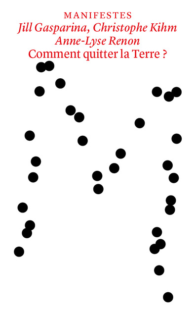
Dans les premières parutions, Nicolas Nova abordait la figure du designer/chercheur, Christophe Kihm, Jill Gasparina et Anne-Lyse Renon revenaient sur le fantasme de l’habitabilité extra-terrestre et Javier Fernàndez Contreras redéfinissait les enjeux de la discipline Architecture d’intérieur. En 2022, Carla Demierre propose un récit autour de l’écriture inclusive qui invite à faire l’expérience du langage écrit et de sa transformation. Anthony Masure reviendra quant à lui sur les enjeux du design à l’ère de l’intelligence artificielle.
Les limites de l’automatisation éditoriale
Dans cet entretien, Dimitri Broquard revient sur les difficultés concrètes qui se sont posées lors de la conception graphique de la collection des Manifestes. S’il n’est pas encore possible d’employer un système centralisé pour générer versions numériques et papiers d’un livre, l’expérience a néanmoins marqué le design des ouvrages.
Sylvain Menétrey : La conception des livres de la collection Manifestes de HEAD – Publishing avait une dimension expérimentale en raison de l’approche multisupport. Comment cette donnée a-t-elle influencé tes choix de maquette ?
Dimitri Broquard : Il faut savoir que je suis issu du graphisme traditionnel, du livre imprimé et que j’ai peu d’expérience en matière de livre numérique. J’ai donc approché la conception des Manifestes en travaillant sur InDesign. L’objectif était de créer des templates pour chaque cas de figure et de hiérarchisation de l’information. Ces éléments de maquette étaient ensuite codés par le développeur, Juan Gomez, avec qui j’ai travaillé étroitement, de manière à ce que les différentes versions soient générées automatiquement. Le codage ouvre des possibilités mais il en ferme également. Par exemple, les Manifestes comportent une dizaine d’images illustratives intégrées dans le flux du texte. Or il était impossible de prévoir une mise en page où image et texte se suivaient organiquement. Il a fallu développer un système où ces deux contenus étaient dissociés. Je me suis aussi rendu compte de la lourdeur de chaque opération : un bloc de texte déplacé en un geste sur InDesign nécessitait parfois plusieurs heures de codage. Chaque décision de maquette potentiellement coûteuse en temps devait être prise avant d’avoir reçu le contenu final des livres, donc de manière très virtuelle. La plateforme Editoria sur laquelle les textes étaient édités et corrigés comportait également ses limites, notamment dans la gestion de certains éléments de microtypographie. Nous nous sommes rendus compte qu’elle ne permettait pas encore de générer un livre imprimé propre, ce qui nous a obligé à un moment à scinder le processus de production en deux et à mettre en page la version imprimée sur InDesign.

S.M. : Comment as-tu pensé la relation formelle entre les différents supports ?
D.B. : Dans mon esprit, la matrice était le livre imprimé en offset, car l’objet vendu en librairies. La version print-on-demand exigeait de remplir certaines conditions de format imposé, de papier et de reliure en choix réduit. Créer un nouveau livre pensé avec ces contraintes aurait impliqué un gros travail de mise en page afin de reprendre les césures qui auraient bougé par exemple. La décision qui s’est imposée a donc été de faire l’équivalent d’un fac-similé du livre offset, donc une copie conforme incorporée dans un format plus grand, ce qui résolvait tous les problèmes de mise en page. Je me suis amusé avec certains aspects propres à ce modèle homemade comme la reliure spirale. Pour la version de lecture à l’écran, la mise en page a été adaptée au format paysage et le contenu, placé en une longue bande verticale, défile maintenant en scrollant.


S.M. : Le concept original des couvertures devait constituer un manifeste en faveur de cette approche de production automatisée.
D.B. : Oui, l’idée était de travailler de façon générative. Les pages intérieures devaient être imprimées en offset et la couverture en numérique, ce qui aurait permis d’imprimer des couvertures uniques pour chaque exemplaire. Ces couvertures affichaient le M de Manifestes généré de manière aléatoire par un algorithme. C’était un travail de développement passionnant, mais qui demeurait plombé par certains bugs. Par exemple, pour le livre de Javier Fernandez Contreras, nous avions décidé que les cinq extrémités du M situées sur le bord de la couverture se déplaçaient sur des axes définis et que les barres de la lettre changeaient d’épaisseur. Selon les cas, ces deux paramètres entraient en conflit, et le M ne devenait plus lisible. À nouveau, le codage devenait très chronophage et nous avons décidé de garder cette idée en réserve, même si c’était très frustrant.
S.M. : Il reste pourtant des traces de ce processus de production dans la version finale des livres. Peux-tu en parler ?
D.B. : En revenant en arrière et en montant les livres imprimés sur InDesign, j’ai ajouté certains détails, comme par exemple les légendes à la verticale, qui auraient été complexes à coder. Mais le projet garde une certaine simplicité dans le design héritée de ce travail préliminaire. Il était aussi prévu qu’Editoria exporte les images de différentes manières selon le format : en couleur en basse résolution pour la lecture à l’écran et en niveaux de gris en haute résolution pour l’impression offset. Nous ne sommes pas revenu sur cette distinction. Évidemment, en travaillant manuellement, nous avons pu retoucher les images des livres imprimés, ce que la plateforme n’aurait pas pu faire.
Notes
- This is the case, for example, for projects financed by the Agence nationale de la recherche (France) and the Fonds national suisse.
- Arthur Perret, “L’impensé des formats : réflexion autour du PDF,” author’s blog, March 7, 2021. https://www.arthurperret.fr/impense-des-formatsreflexion-autour-du-pdf.html
- This is the case, for example, for projects financed by the Agence nationale de la recherche (France) and the Fonds national suisse.
- Alexandre Saint-Jevin, “Essai pour une méthode d’analyse plastique du vidéoludique,” Conserveries mémorielles, no. 23, 2018. http://journals.openedition.org/cm/3213
- Anthony Masure, “Copier/Varier. Standards, critiques et contre-emplois des logiciels de création,” in David Christoffel and Nathalie Blanc (eds), Multitudes, no. 82, 2021, “Globalisations esthétiques.”
- https://editoria.pub
- https://www.pagedjs.org
- This expression has been used and commented by the researcher Louis-Olivier Brassard (see the author’s blog, November 2021) : https://journal.loupbrun.ca/en/n/123/“
- Julie Blanc, “A paged.js hackathon at EnsadLab,” Paged.js blog, March 18, 2021. https://www.pagedjs.org/posts/2021-03-hackathon/
- Lauren Lee McCarthy (@laurenleemack), tweet April 2, 2021. https://twitter.com/laurenleemack/status/1378020279545331723
- Marcello Vitali-Rosati, “Ce qui pourrait être autrement: éloge du non-fonctionnement,” author’s blog, March 18, 2021, http://blog.sens-public.org/marcellovitalirosati/cequipourrait/fonctionnement.html
- Pierre-Damien Huyghe, Sociétés, services, utilités [à quoi tient le design], Grenoble, De L’Incidence éditeur, 2018.
Related content

19.04.2023
In touch with history
Interview with Pierre Leguillon about the digital version of his book "Oracles"
The collector′s book, Oracles – Artists’ Calling Cards, reinvents itself in digital format and reaches out to a wider audience. In this interview, Pierre Leguillon, the instigator of this multi-faceted project under…

16.09.2021
Agence de tutorat artistique
An interview with collective Medium Sans Serif and a performed reading by Inès Berdugo
The history of artists is marked by two contradictory impulses: first, to free oneself from the judgement of institutionally approved personalities, and second, to overcome one’s own solitude. This double fantasy acts…
03.03.2021
The joy of writing and rewriting
An interview with Carla Demierre and Fabienne Radi
While remote teaching has momentarily transformed their common creative writing course into a podcast, Fabienne Radi and Carla Demierre nonetheless advocate for experiential learning: the experience of reading, writing and rewriting beyond…